
There’s plenty that can be done whether you’re revamping a site that’s been around for 10 years, or starting a new page from scratch today. Moving forwards, accessibility is something that should be foundational – in the same way that design should start with positive (functional) user experience or content should be written with SEO in mind. Here are seven key starting points for designing, writing, and developing with accessibility in mind:
1. Thinking in Colour and Contrast
Colour, contrast, and pattern are absolutely crucial for those 27.4 million people in Europe who experience issues with vision, and many more globally. You should provide sufficient contrast between foreground and background for all web elements, including text, buttons and form fields. The only exception is inactive links (i.e. greyed out) or purely decorative elements. While black on white offers optimal contrast, it's not the only accessible option – you just need to get the contrast ratios right.
It’s also good practise to use more than just colour to communicate. For example, in a form with required fields, it’s better to find an additional or alternative method to highlight those required than simply marking them a different colour. Where you might previously have written “Required fields are in red”, try instead “Required fields are in red and marked with an asterisk (*)“.

Another example is highlighting or referencing content by colour. To somebody who has no issue seeing colour, a red button might indicate that a form has not been correctly completed. For somebody who is colourblind, the button’s colour might mean very little. By including an additional element – like pattern, icon or text – communication and referencing becomes much simpler. Trello’s “Colorblind Friendly Mode” is a great example of how to execute this effectively.
2. Make It Interactive
It’s key that interactive elements on websites, such as links, buttons, and form controls, are clearly distinguishable from standard content. Distinctive styles for these elements, that align with your brand and are visually consistent, ensure those navigating in any method (mouse, keyboard, screen reader) can easily identify and differentiate. Below is an example from W3C’s Web Accessibility Initiative.
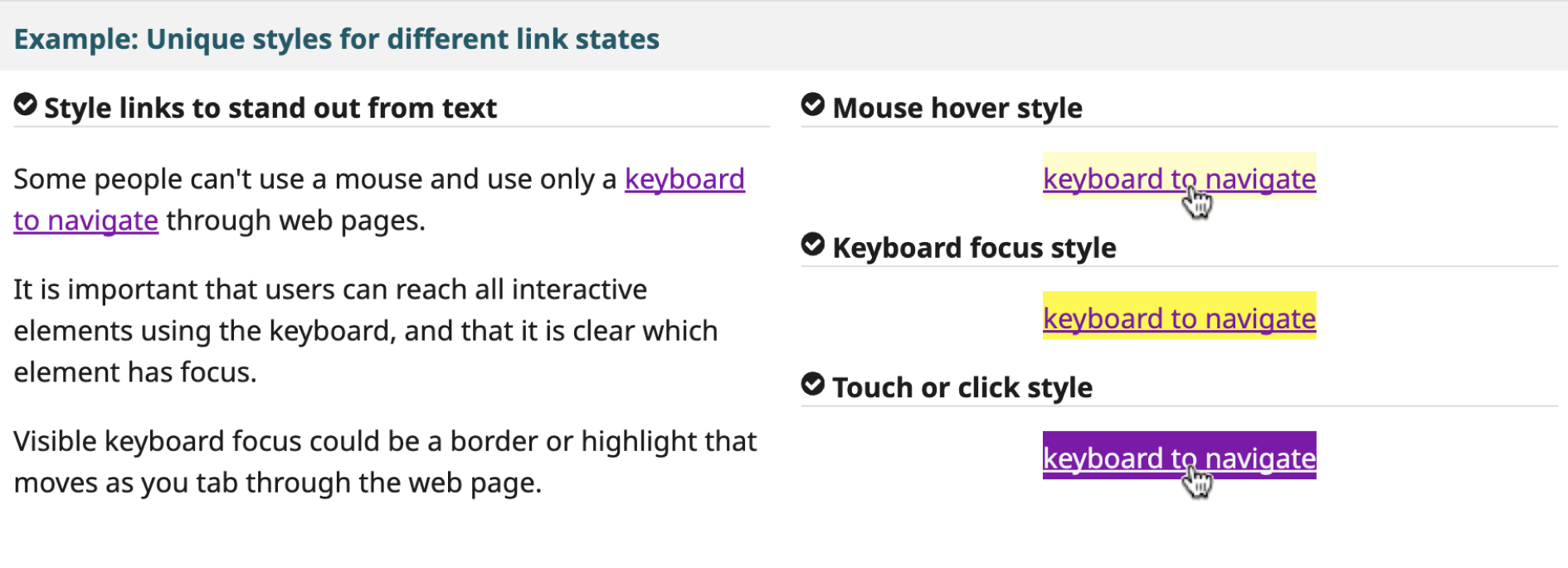
3. Caption It
Podcasts and video content are increasingly engaging, but if you aren’t providing closed captions or transcripts then you’re missing a trick for the wider audience, who may be deaf, hard of hearing, or in an environment where audio isn't accessible. For audio content, it’s good practice to provide a transcript. This should not only communicate the spoken content but also include any other key information that provides context, such as speaker changes or relevant sound cues.
For videos, both closed captions and transcripts make sense – and again, be sure to describe any essential visual context in the transcript that might otherwise be missed. Gymnasium offers valuable resources on digital accessibility, including this great video on accessible audio and video here.
4. Optimise ALT Tags
Alt tags, or alternative text descriptions, allow those with low visual ability to basically “hear” web content through screen readers. If you’re sharing photos, illustrations, or graphics and you’re not completing those alt text fields, you’re making that content inaccessible to a significant portion of your audience who can’t see it.
Don’t just write “picture” or “image” in this field. Instead, provide a concise description of what is pictured and how it’s relevant to the page’s content. Think of it as if someone was describing the image to you over the phone. Leave the alt text blank, and the screen reader will just read the file name… that’s not something anybody wants!
5. Utilise Structure and Hierarchy
When developing a website, you’re able to set styles for text content using HTML elements. For example, you might set a large bold font for your <h1> tag, and a <h3> style might just be the same as your standard text but italicised. Using these heading tags (<h1> to <h6>) as they’re intended establishes a hierarchy that allows your content to be easily navigated, especially for those using assistive technologies. Get it wrong and suddenly navigating your content is a nightmare.
Having a style guide that effectively communicates how these elements should work prevents the misuse of navigating styles for visual effect. However, it can get much more complex than this. Accessible navigation involves more than just text styling, so consider consulting with someone in web development. Check out W3C’s example here too!
6. Tap Targets
Adequate tap target sizes are essential for all users, regardless of motor skills, and you’ve likely experienced this frustration yourself. Particularly on mobile devices, the interactive area (tap target) for a button, links, and form elements must be large enough for you to easily activate it. If this isn’t possible, consider whether there is a design workaround that changes the dynamic of the button. One example of this is on the YouTube application, the Play/Pause button isn’t accessible in the bottom left corner (as it would be on desktop) and so the centre of the video offers that functionality instead.
While specific guidelines vary on the exact tap target sizes, it’s best to test this rigorously to work out what works best for your app or website.
7. Keyboard Navigation
A lot of these steps don’t matter if you can’t utilise accessible navigation. Keyboard navigation is a more universally accessible option compared to relying solely on a mouse or touchscreen. Make sure that – at the very least – users can navigate through all interactive elements (links, buttons, form fields) using the Tab, Enter and Spacebar keys. Provided you’ve established clear hierarchical navigation through coding, these keys should allow for a logical and intuitive user experience.
This list is by no means a comprehensive to-do list to get your website to a place where it is universally accessible but it is a good start if you can comfortably say that you’re thinking about these things when you’re updating or designing. Even better if you can say comfortably that you’re already doing these things!
If there’s just one thought to leave you with, it’s that there are countless accessibility tools available for you to utilise. You can test your page in all sorts of ways, and you should. Test, test, and test again. If you can, get real feedback from real people. If not, the tools online should help to begin to simulate some of the user experiences to help you understand what you’re working towards. Making your site more accessible improves the experience for everyone.
If you'd like to find out more about the whys and how-tos surrounding digital accessibility, you can download our free guide The Future is Inclusive: A guide to digital accessibility here.
About the author

As European Marketing Manager at Aquent, Ben is driving the strategic evolution of the brand across a competitive and rapidly changing European landscape. Focused on elevating awareness of Aquent’s full suite of services—from talent recruitment to creative agency solutions and project management tools—he brings a creative, insight-driven approach to brand positioning. With a background spanning copywriting, SEO, and digital strategy, Ben blends creative storytelling with performance marketing to drive meaningful growth and engagement across Europe.
Latest.

How companies can champion women’s leadership roles in the tech industry.
Thought Leadership


Save your tears for the boardroom.
Thought Leadership


Trust, innovation & human connection: Redefining financial services at Eight.
Thought Leadership